WooCommerce CSS Product Labels
Overview
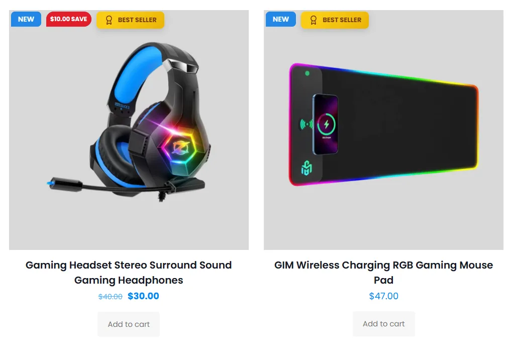
CSS Labels are text badges drawn entirely with CSS — no images needed. They load instantly, stay razor-sharp on any screen, and are the quickest way to add a "Sale", "New", or "Hot" label to your products. The plugin includes 15+ ready shapes (ribbons, corners, circles, flags, and more).
Use CSS Labels when you want fast, lightweight text badges that you can fully recolor and reshape to match your brand.
Sale Booster's WooCommerce CSS labels make it easy to create a WooCommerce sale badge or WooCommerce new product badge without editing theme files. Choose from flexible WooCommerce badge shapes and style the CSS product labels to match your storefront.
How it works
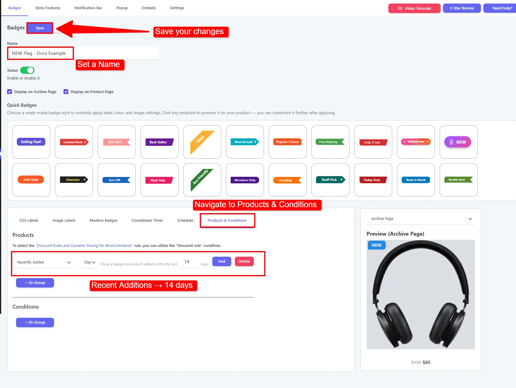
You want a green "NEW" flag on every product added in the last 14 days. You open the CSS Labels tab, type NEW, pick the flag shape, set the color to green, and place it top-left. In the Products & Conditions tab you choose Recently Added → 14 days. Done — new arrivals are automatically flagged, and each product drops the flag once it's older than two weeks.
CSS Labels and the 15+ shapes are available in the Free version. Gradient colors, rotation, and animation effects are enhanced in Pro.
Step-by-step setup
1. Write the label text
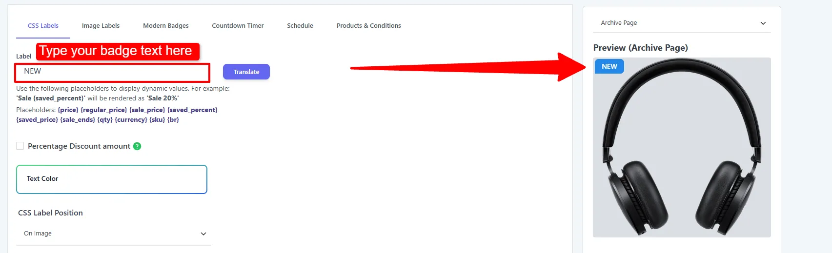
In the CSS Labels tab, type your text in the Label field (e.g. SALE). To show live values like the discount percentage, use a placeholder such as {saved_percent} — the plugin swaps in the real number per product.
2. Choose a shape
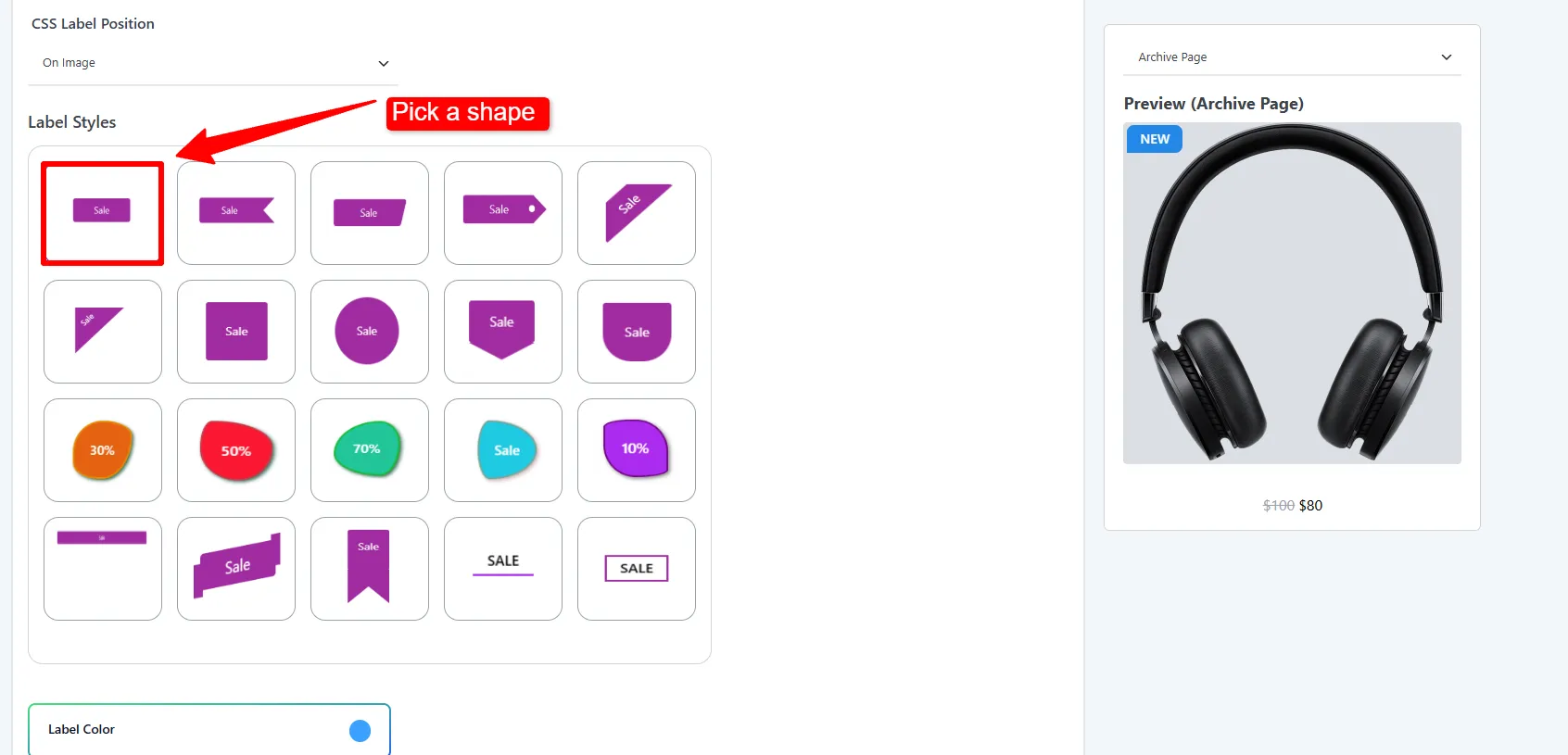
Pick one of the built-in shapes from the gallery. The live preview on the right updates instantly.
3. Style, position, and (optionally) animate
Set the color, size, corner placement, and any animation, then Save.
Options explained
Label & text
| Option | What it does | When & why to use |
|---|---|---|
| Label | The badge text. Supports placeholders. | Keep it short (1–2 words) so it fits the shape. |
| Percentage Discount amount | Replaces the text with the live discount %. | Turn on for a pure "20% OFF" badge with zero manual updates. |
| Text Color | Solid or gradient text color. | Use high contrast against the badge color for readability. |
| CSS Label Position | On Image or Out of Image. | On Image overlays the photo; Out of Image sits under the title/price — use it if a badge would cover important product detail. |
| Translate | Add translations per language. | Multilingual stores — see Translation. |
Shape & style
| Option | What it does | When & why to use |
|---|---|---|
| Badge Color | Background color (solid/gradient). | Match your brand or use red for urgency. |
| Width / Height | Badge size (separate for archive & product pages). | Enlarge slightly on product pages where there's more room. |
| Border Radius | Rounds each corner independently. | Soften corners for a modern look, or keep square for ribbons. |
| Border Width / Color | Optional outline. | Add a border when the badge sits on a busy photo. |
| Font Size / Weight / Line Height | Text typography, set separately for Archive Page and Product Page. Weight options: 500, 600, Normal, Bold, Bolder, Lighter. | Use Bold/600+ so short labels read clearly. |
| z-index | Stacking order. | Increase if the badge hides behind theme elements. |
Opacity & rotation
| Option | What it does | When & why to use |
|---|---|---|
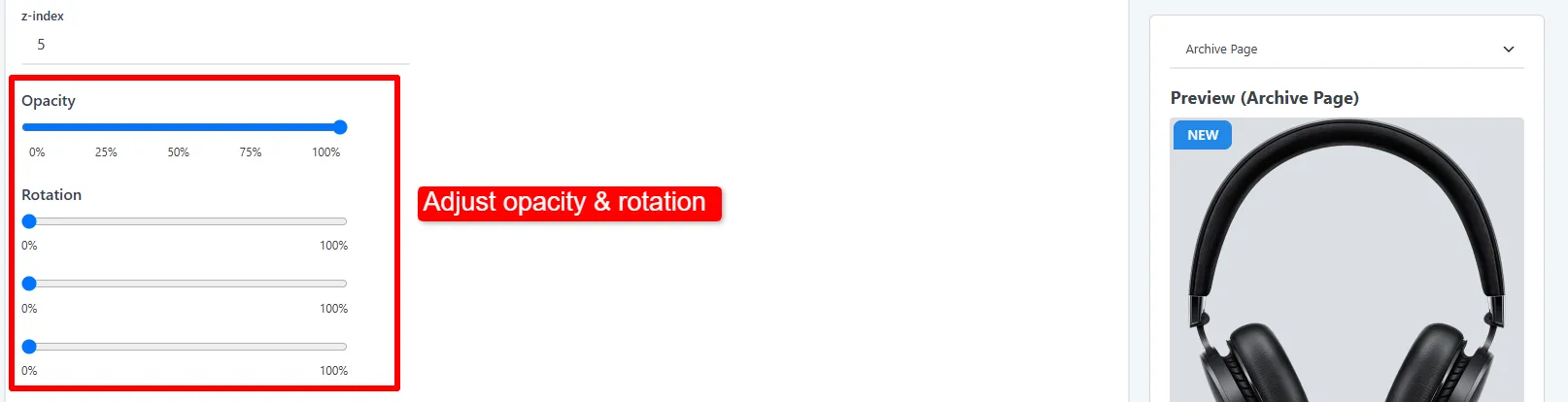
| Opacity | Fades the badge 0–100%. | Slightly reduce for a subtle, premium feel. |
| Rotation X / Y / Z | Tilts/flips the badge in 3D. | Angle a ribbon diagonally across a corner. |
| Horizontal / Vertical offset | Nudges the position. | Fine-tune so the badge clears rounded image corners. |
Position
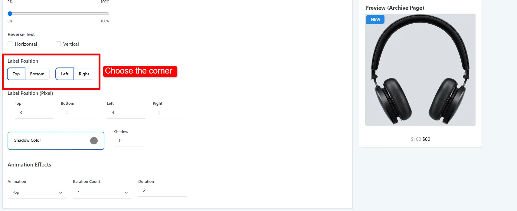
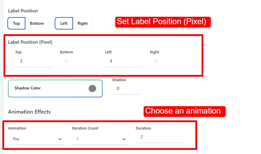
Anchor the badge to the Top-Left, Top-Right, Bottom-Left, or Bottom-Right of the image and fine-tune the exact offset. When set to Out of Image, align it left, center, or right.
Shadow & animation
- Shadow — set a color and width to lift the badge off the image. Use sparingly on busy photos.
- Animation — choose an effect: Swing, Flicker, Pulse, Rotate, Flash, Jump, Pop, Spring, Wobble, Flip, or Visibility (or None). Set Iteration Count (1–5 or Infinite) and Duration (seconds).
Products & Conditions
- Recently Added — select Recently Added → 14 days to target new products.
A single Pulse once or twice draws the eye to a flash sale without distracting from the Add to Cart button. Avoid infinite fast animations on every product — it looks noisy.
🧪 Example configuration
A green "NEW" flag for recent arrivals:
| Setting | Value |
|---|---|
| Label | NEW |
| Shape | Flag / corner |
| Badge Color | Green (#1faa59) |
| Text Color | White |
| Position | Top-Left |
| Animation | Pop, 1 iteration |
| Targeting | Recently Added → 14 days |
What customers see
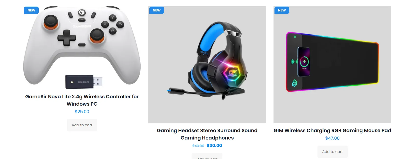
New products display a crisp green "NEW" flag in the top-left corner on both the shop grid and product page.
- Keep labels to 1–2 words so they never overflow the shape.
- Use red for urgency (sale/clearance), green for positive (new/eco), black for premium.
- Prefer Out of Image when the on-image badge would cover the product itself.
Next Steps
Frequently Asked Questions
How do I add a CSS sale badge in WooCommerce?
Go to Sale Booster → Badges → Add New, open CSS Labels, enter text such as SALE, choose a shape and color, then configure Products & Conditions before saving.
Can a CSS product label show a live discount percentage?
Yes. Use the {saved_percent} placeholder or enable Percentage Discount amount so the badge can display the current discount for each product.
Should a CSS label appear on or outside the product image?
Choose On Image for a compact overlay. Choose Out of Image when the badge could cover important product photography or when your theme already places text over the image.