WooCommerce Quick View: Product Popup Setup Guide
Overview
WooCommerce Quick View lets shoppers preview a product—image gallery, price, short description, and Add to Cart—in a popup or sidebar without leaving the shop or category page. This WooCommerce product quick view keeps product discovery moving while giving shoppers a direct Quick View add to cart path.
How it works
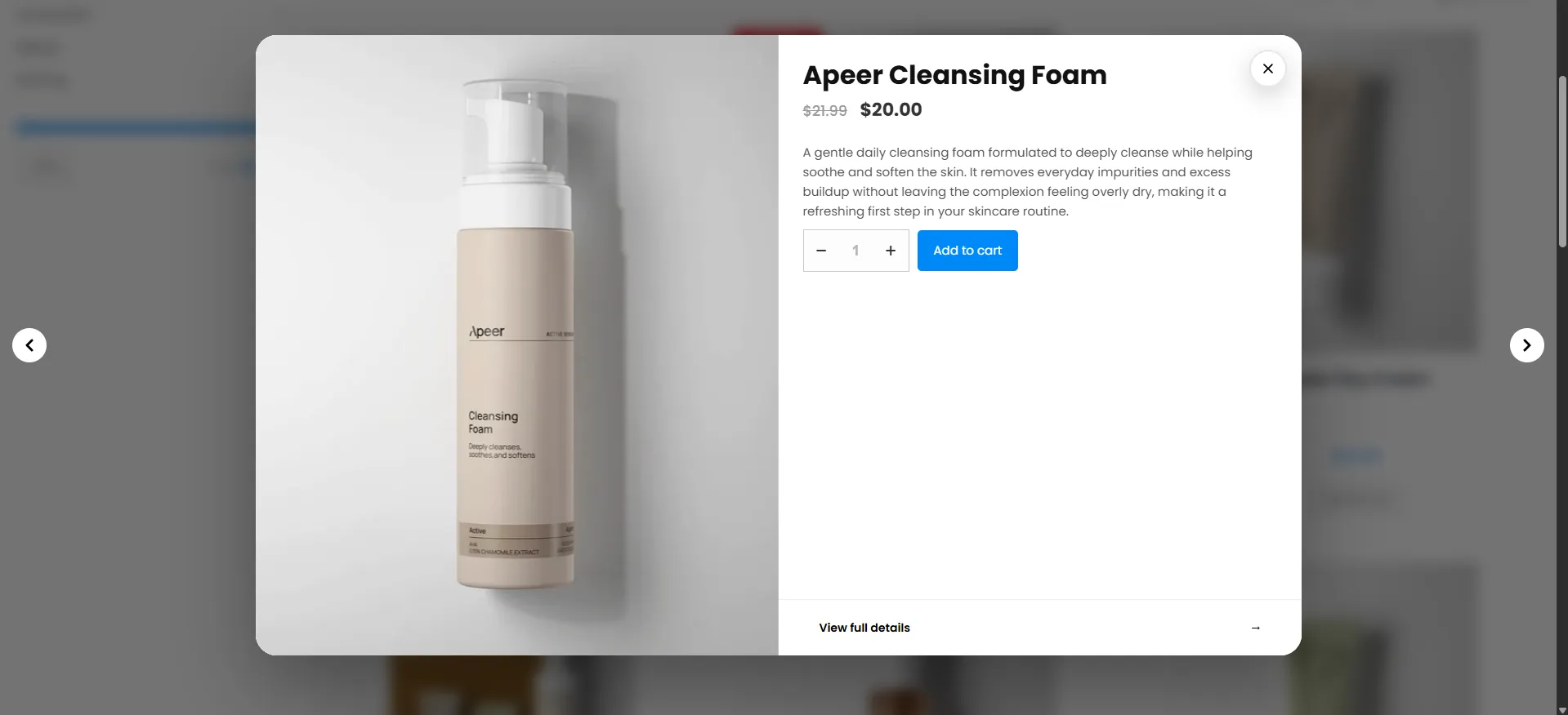
A shopper scans your shop grid and spots something interesting. Instead of loading a full product page, they click the Quick View trigger on the image; a modal opens with the gallery, price, description, and an Add to Cart button — and Previous/Next arrows to flip through nearby products. They add it and keep browsing — no page reload, no lost momentum.
Quick View is available in the Free version. Multiple popup themes and advanced styling are enhanced in Pro.
Popular use cases
| Your goal | How to set it up |
|---|---|
| Faster browsing on a large catalog | Type: Popup with an icon trigger on the image — shoppers preview and add without leaving the grid. |
| Let shoppers compare several items quickly | Turn on Enable Previous/Next Buttons so they can flip through adjacent products inside the modal. |
| Fewer taps on mobile | Enable Quick View on Mobile and set the Icon Position on Image (Mobile). |
| Keep the trigger subtle | Enable Show Icon on Hover so it only appears when hovering a product. |
| Sell variable products faster | The modal includes the quantity and Add to Cart, so shoppers add in one step. |
| Keep previews fast and scannable | Set Description to the short description so the modal stays light. |
| Match your brand | Fine-tune the modal, button, footer, and icon colors on the Design tab. |
If your product pages carry a lot of decision-critical content (size charts, detailed specs, reviews), send shoppers to the full page instead — Quick View is best for fast, visual, low-consideration purchases.
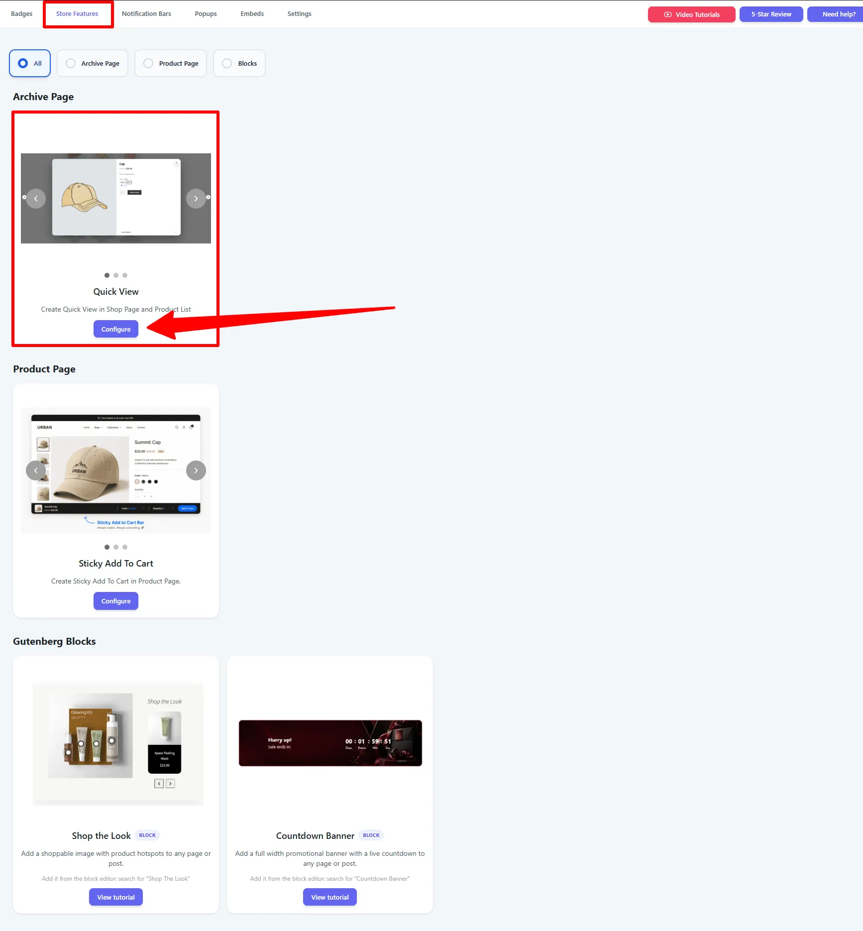
Step 1 — Open it from Store Features
Go to Sale Badges → Store Features, then on the Quick View card (under Archive Page) click Configure.
Step 2 — General settings
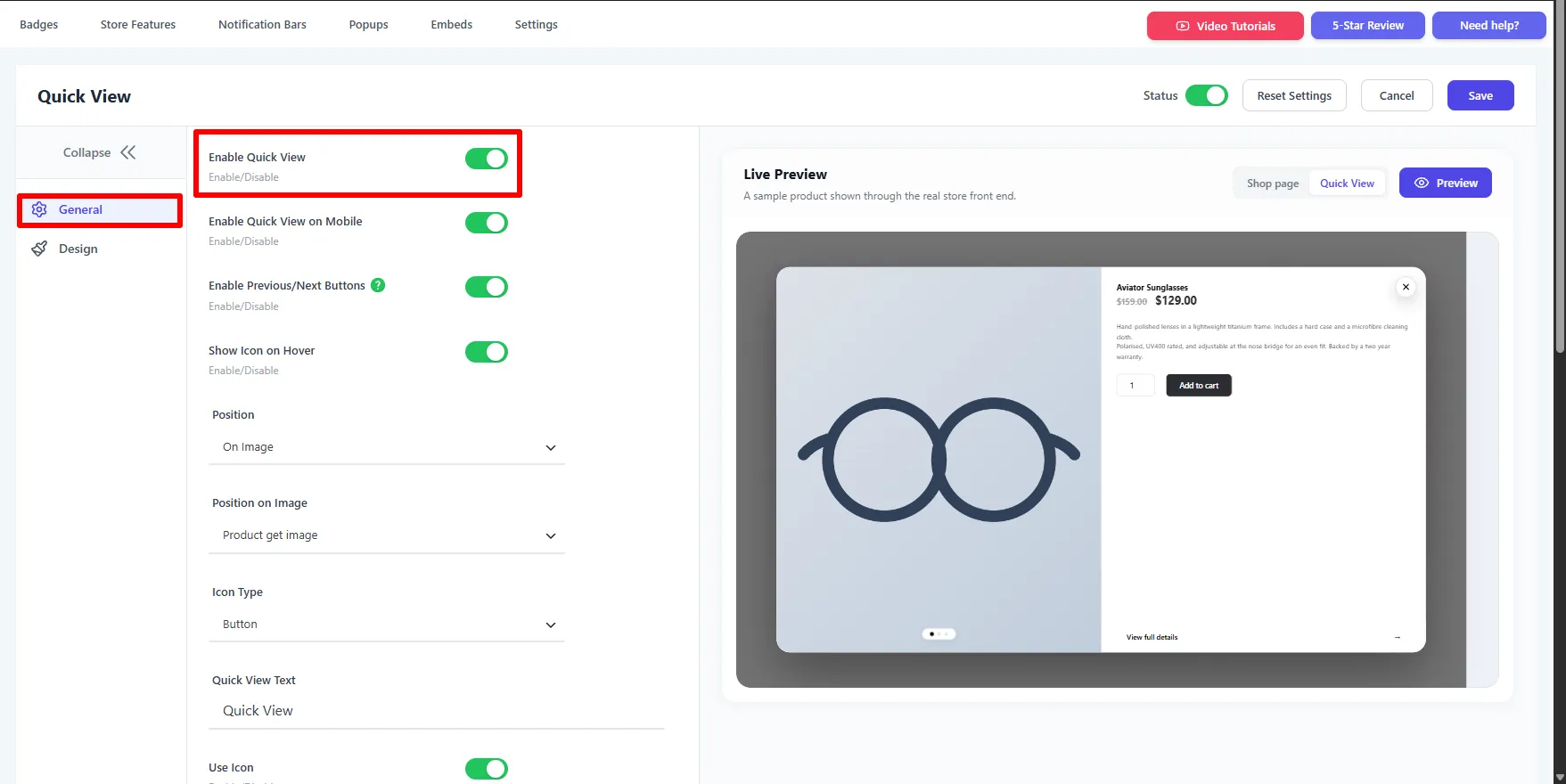
Toggle Status on, then set the behavior and trigger on the General tab. The Live Preview on the right has a Shop page / Quick View switch so you can check both the trigger and the modal.
Enable it and choose the trigger
- Enable Quick View / Enable Quick View on Mobile — turn the feature on per device.
- Enable Previous/Next Buttons — let shoppers flip through nearby products in the modal.
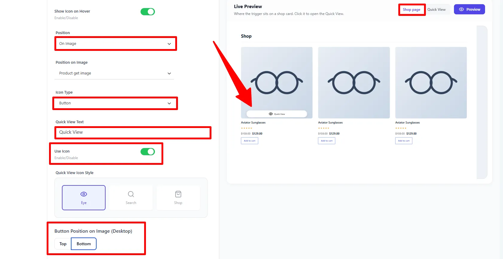
- Show Icon on Hover — reveal the trigger only on hover.
- Position — On Image or Out of Image; Position on Image picks the hook (e.g. Product get image).
- Icon Type — a Button or an Icon; Quick View Text sets the button label (e.g.
Quick View).
Icon style and placement
- Use Icon + Quick View Icon Style — pick Eye, Search, or Shop.
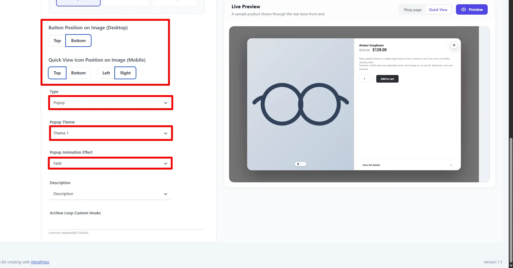
- Button Position on Image (Desktop) — Top or Bottom.
Display type, theme and animation
- Icon Position on Image (Mobile) — Top / Bottom / Left / Right.
- Type — Popup or Sidebar.
- Popup Theme — the modal's look (e.g. Theme 1).
- Popup Animation Effect — the opening effect (e.g. Fade).
- Description — show the short or full description.
- Archive Loop Custom Hooks — advanced placement, if your theme needs it.
Step 3 — Design
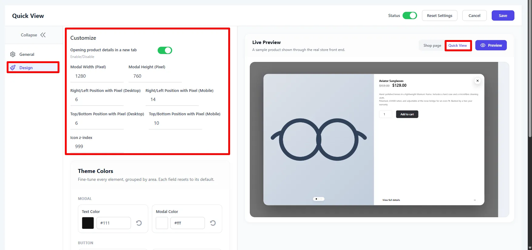
The Design tab controls the modal's size, position, and colors.
Customize
| Setting | What it does |
|---|---|
| Opening product details in a new tab | Make View full details open in a new tab. |
| Modal Width / Height (Pixel) | The modal size (e.g. 1280 × 760). |
| Right/Left & Top/Bottom Position (Desktop / Mobile) | Fine-tune the trigger's offset per device. |
| Icon z-index | Stacking order — raise above sticky headers if needed. |
Theme Colors
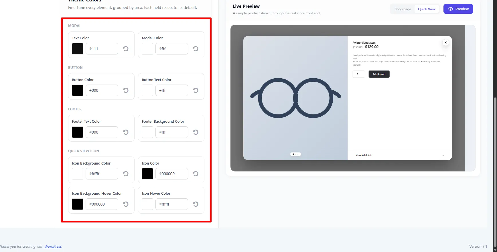
Fine-tune every element, grouped by area — each field resets to its default:
- Modal — Text Color, Modal (background) Color.
- Button — Button Color, Button Text Color.
- Footer — Footer Text Color, Footer Background Color.
- Quick View Icon — Icon Background / Icon Color, plus their hover colors.
🧪 Example configuration
The setup shown in the screenshots:
| Setting | Value |
|---|---|
| Type | Popup |
| Popup Theme / Animation | Theme 1 · Fade |
| Icon Type / Text | Button · Quick View |
| Icon Style | Eye |
| Button Position (Desktop) | Bottom |
| Previous/Next | Enabled |
| Devices | Desktop + Mobile |
| Modal size | 1280 × 760 |
What customers see
Clicking the trigger opens a clean preview modal with the product image, price, short description, a quantity + Add to cart button, a View full details link, and Previous/Next arrows — everything needed to buy, without leaving the shop.
- Enable Previous/Next so shoppers can browse several products without closing the modal.
- Use the short description to keep the preview fast and scannable.
- On mobile, set the icon position so the trigger doesn't overlap other badges.
SEO and accessibility checklist
Keep the normal product-card link and the View full details link available when Quick View is enabled. The popup should speed up browsing, while the canonical product page remains the source of complete descriptions, variations, reviews, structured data, and indexable content. Use a descriptive trigger such as Quick View, ensure the close control is keyboard accessible, return focus to the trigger when the popup closes, and check that the modal does not trap shoppers on mobile.
Measure trigger clicks, popup loads, variation selections, Quick View add-to-cart actions, product-page visits, and completed orders. Compare the popup and sidebar types on a representative category rather than assuming that more interface elements produce more sales. Google’s Product structured data documentation is a useful reference for keeping the underlying product page data accurate.
Frequently Asked Questions
What is WooCommerce Quick View?
WooCommerce Quick View is a product preview that opens from a shop or category grid. Sale Booster can show the product image, gallery, price, short description, quantity, variations, Add to Cart, and a link to the full product page.
Does WooCommerce Quick View work on mobile?
Yes. Enable Quick View on Mobile, choose the mobile icon position, and test the trigger at common phone widths. Keep the button clear of sale badges and other product-card controls.
Can shoppers add a product to the cart from the Quick View popup?
Yes. The popup or sidebar can include quantity, variations where applicable, and an Add to Cart button. Variable products should be tested with every required option before launch.
Does Quick View replace the WooCommerce product page?
No. Quick View is a faster preview for product archives. Keep the full product-page link, complete product information, and normal SEO content available for shoppers who need more detail.