Side Cart
📋 Table of Contents
- Overview & How It Works
- The Side Cart Settings Screen
- General Tab
- Side Cart Tab
- Icon Tab
- Styles Tab
- Addons Tab
- Example Configuration
- What Customers See
- Next Steps
Overview
The Side Cart is a slide‑out cart drawer that opens the instant a product is
added — no page reload, no detour to /cart/. Shoppers review their items,
adjust quantities, apply a coupon, and jump to checkout while staying exactly
where they were browsing. Fewer steps between add to cart and pay means
fewer chances to abandon.
The Side Cart is also the foundation for Side Cart Upsells and the premium add‑ons (free‑shipping bar, rewards, and more) described below.
How it works
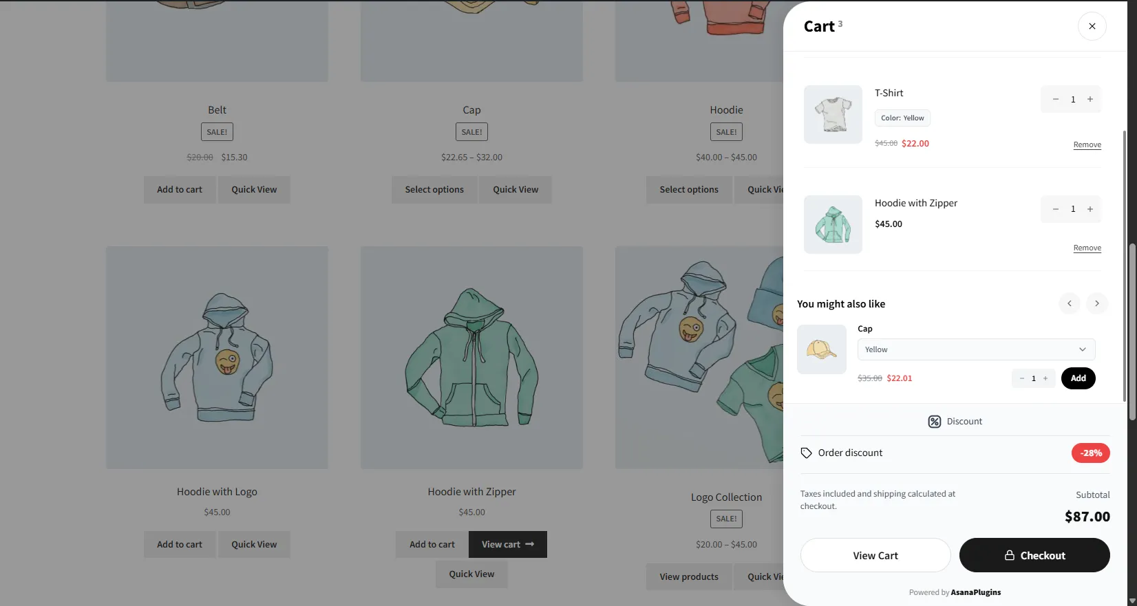
A customer adds a Vintage Cap while browsing your shop. Instead of reloading, a drawer slides in from the right showing the cap alongside the rest of the cart, an order discount, a running subtotal, and View Cart / Checkout buttons — all one click away.
The Side Cart settings screen
Open Side Cart & Upsell → Side Cart. Settings are organized into five tabs, with a live preview (desktop/mobile) on the right that updates as you change options:
| Tab | What it controls |
|---|---|
| General | Where and when the drawer appears |
| Side Cart | What's inside the drawer (layout, labels, buttons) |
| Icon | The cart icon that opens the drawer |
| Styles | The drawer's full color palette |
| Addons | Conversion boosters, including Side Cart Upsells |
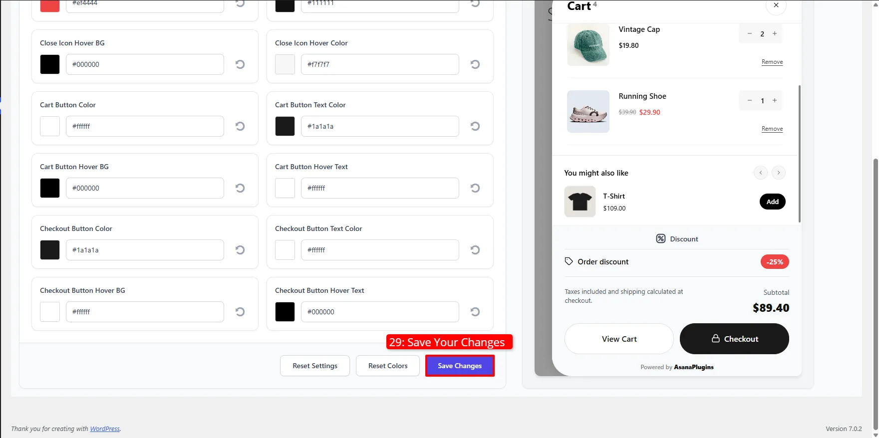
Click Save Changes when you're done. Use Reset Colors to restore default colors, or Reset Settings to restore all Side Cart options.
General tab
Controls visibility and behavior.
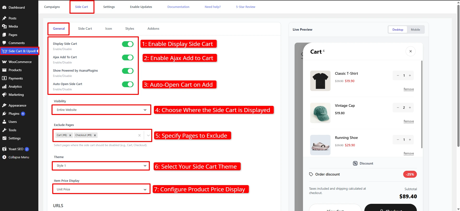
- Toggle Display Side Cart on to enable the drawer store‑wide.
- Toggle Ajax Add To Cart on so items are added without a page reload — this is what lets the drawer appear instantly.
- (Pro) Toggle Show Powered by AsanaPlugins on or off.
- Toggle Auto Open Side Cart on so the drawer opens automatically right after a product is added.
- Set Visibility — Entire Website, WooCommerce Page, or None.
- Under Exclude Pages, add pages where the drawer shouldn't appear (e.g. Cart and Checkout, since customers are already there).
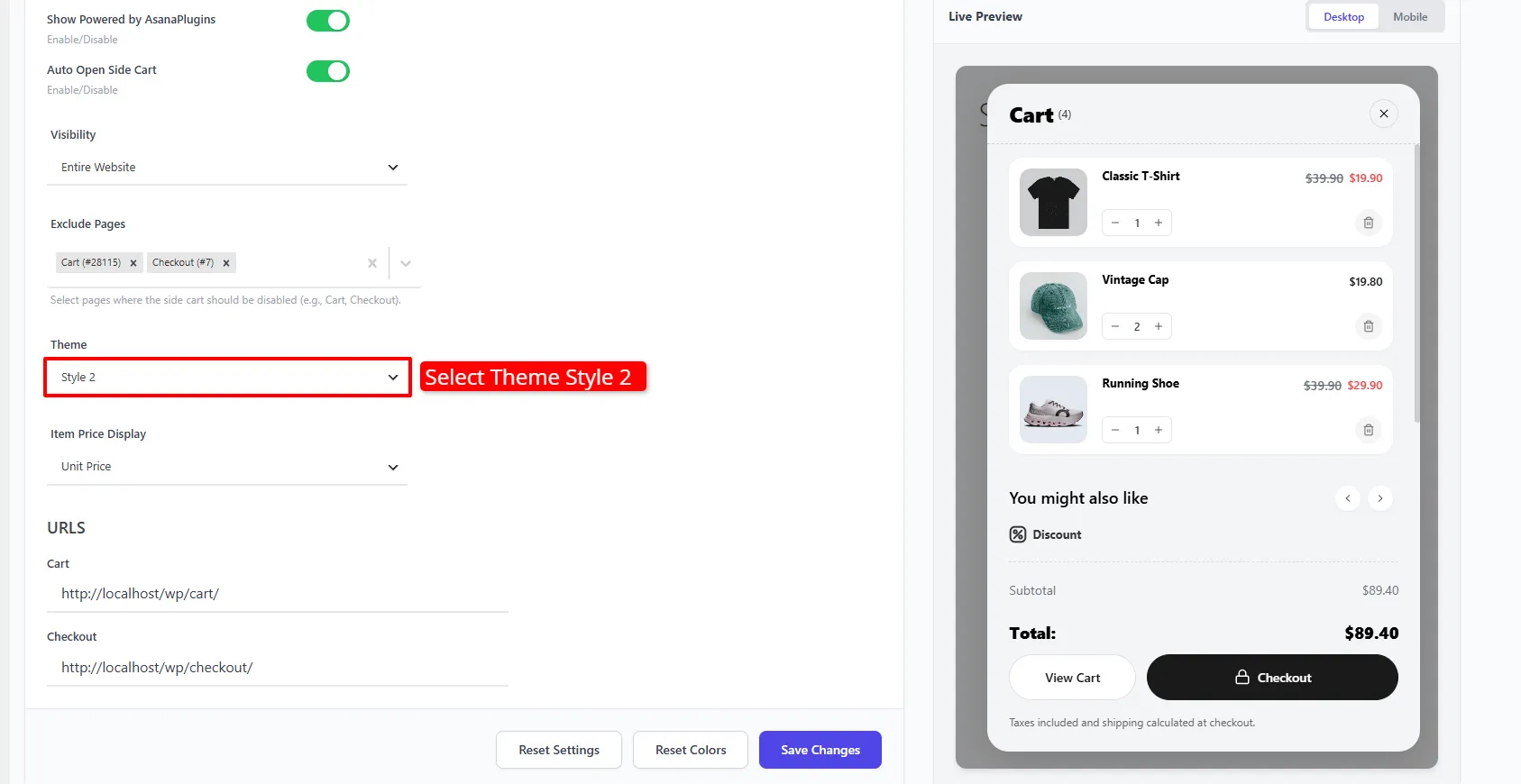
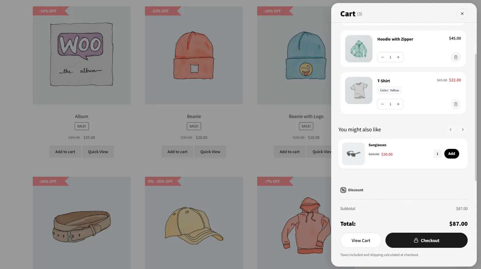
- Choose a Theme — Style 1 (light) or Style 2 (soft‑grey card).
- Set Item Price Display to Unit Price or Item Subtotal.
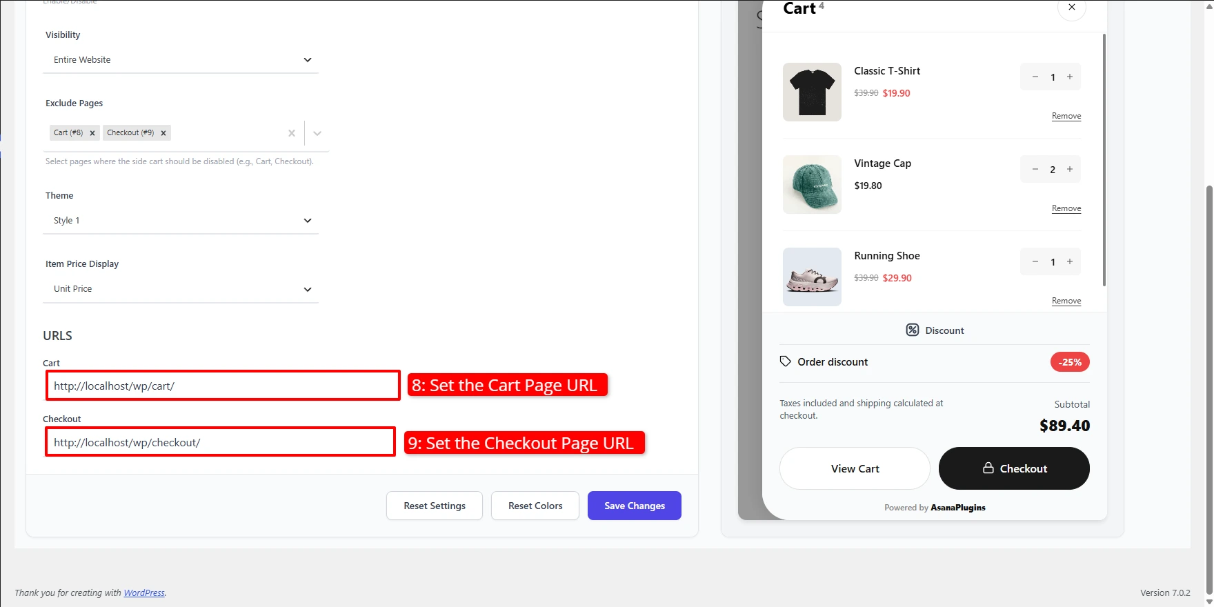
- Under URLs, confirm the Cart and Checkout links the drawer's buttons point to, then click Save Changes.
Selecting Style 2 gives the drawer a rounded, soft‑grey card look. The live preview updates instantly so you can compare before saving.
Side Cart tab
Controls what appears inside the drawer.
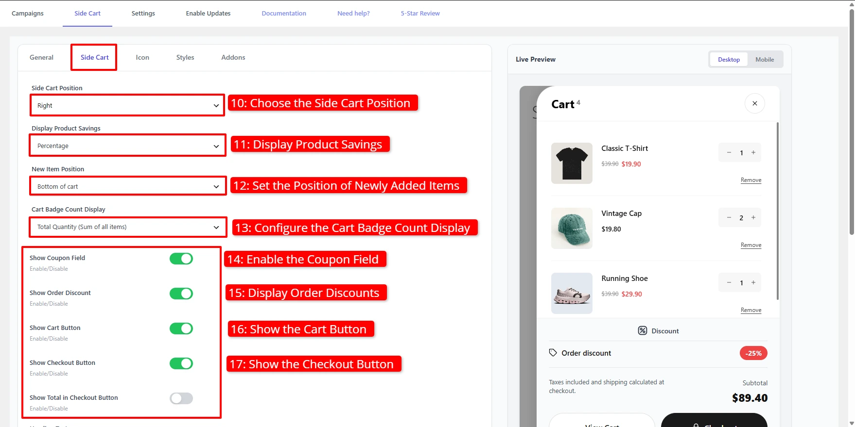
- Choose the Side Cart Position — Left or Right.
- Set Display Product Savings to show discounts as a Percentage or an Amount.
- Set New Item Position so newly added items land at the Top or Bottom of cart.
- Choose how Cart Badge Count Display counts items — Total Quantity (Sum of all items) or unique line items.
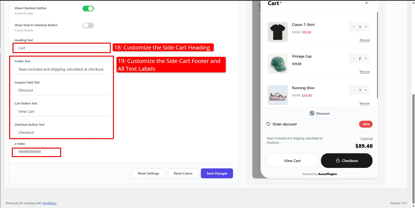
- Toggle Show Coupon Field and Show Order Discount to surface discounts directly in the drawer.
- Toggle Show Cart Button and Show Checkout Button to control which call‑to‑action buttons appear.
- Toggle Show Total in Checkout Button to print the subtotal on the button.
- Customize the label text: Heading Text, Footer Text, Coupon Field Text, Cart Button Text, and Checkout Button Text.
- Adjust z‑index if another theme element covers the drawer.
Icon tab
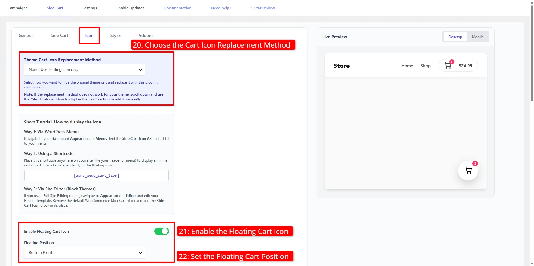
Controls the cart icon that opens the drawer.
- Choose the Theme Cart Icon Replacement Method — for example None (Use
floating icon only) to rely solely on the floating icon, or a replacement
method to swap your theme's cart icon. If the automatic method doesn't fit
your theme, use the built‑in Short Tutorial to place the icon manually:
- Via WordPress Menus — add the Side Cart Icon AS item under Appearance → Menus.
- Via shortcode — drop
[asnp_weuc_cart_icon]anywhere (e.g. header). - Via the Site Editor — replace the default Mini‑Cart with the Side Cart Icon block.
- Toggle Enable Floating Cart Icon for a sticky cart button, and set its Floating Position (e.g. Bottom Right).
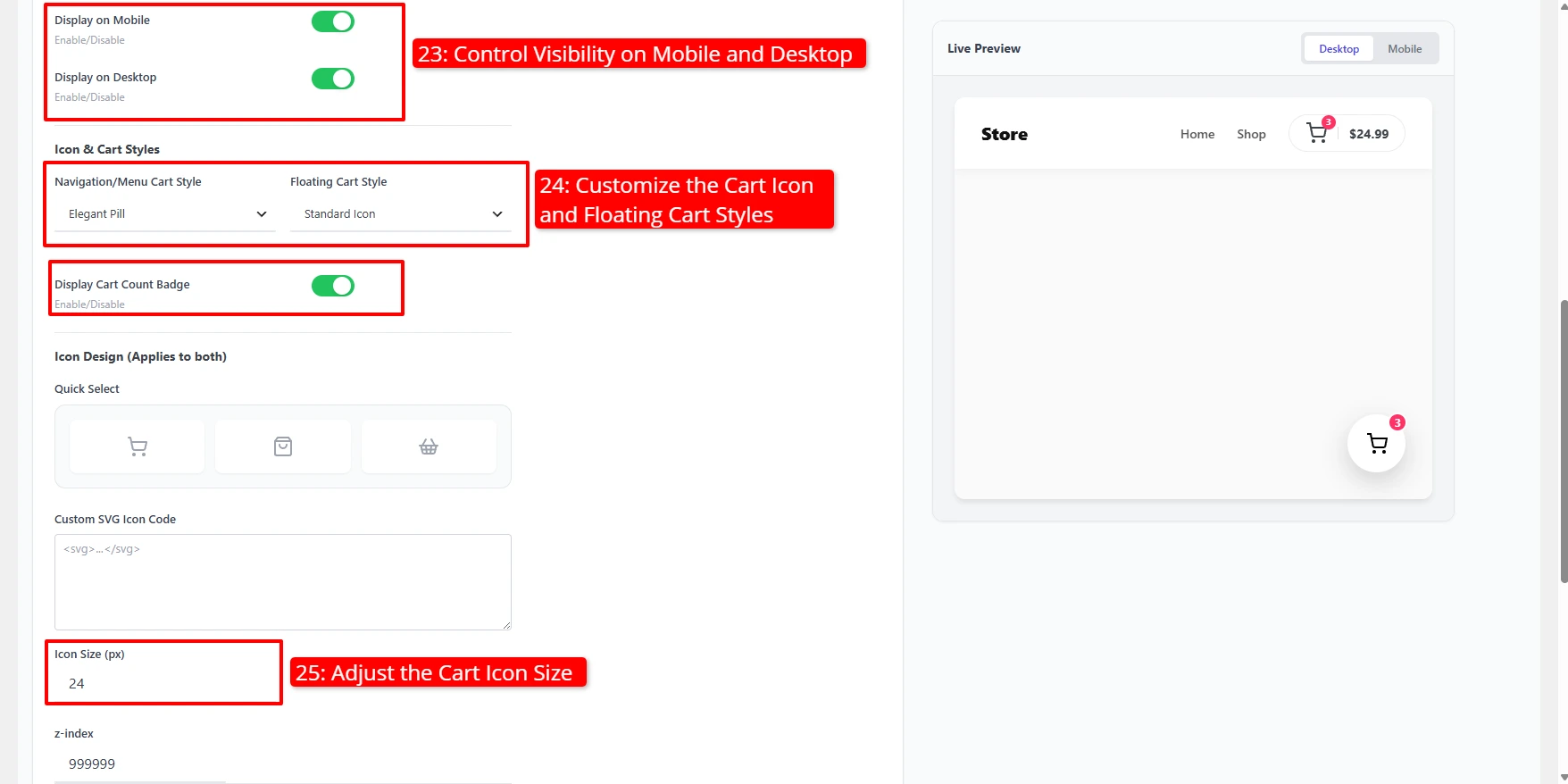
- Toggle Display on Mobile and Display on Desktop to control where the floating icon appears.
- Under Icon & Cart Styles, set the Navigation/Menu Cart Style (e.g. Elegant Pill) and the Floating Cart Style (e.g. Standard Icon).
- Toggle Display Cart Count Badge to show the number of items on the icon.
- Under Icon Design (applies to both), pick a Quick Select preset icon or paste Custom SVG Icon Code, then set the Icon Size (px).
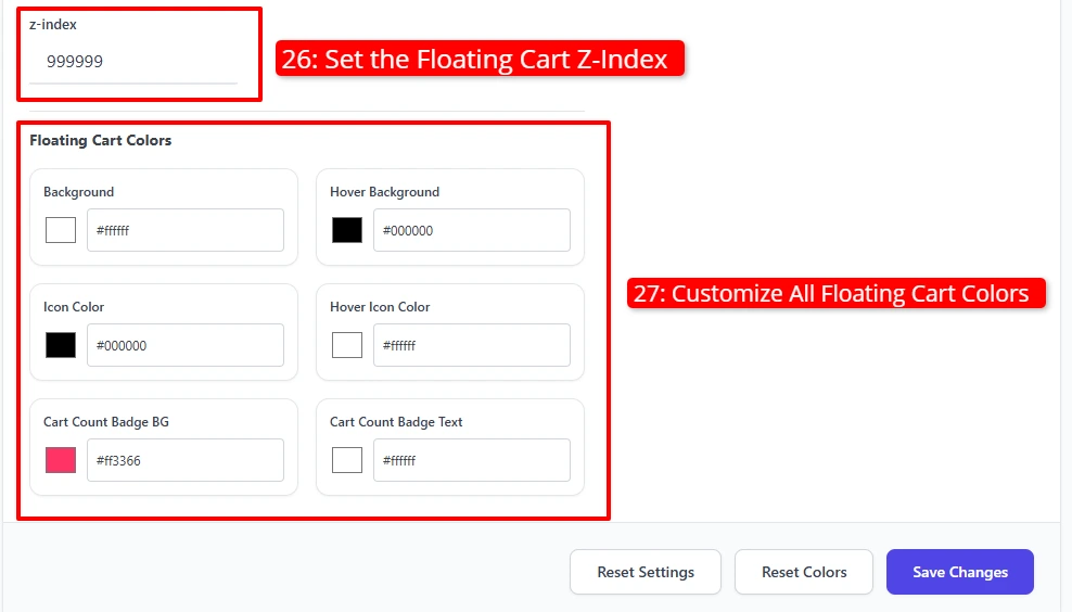
- Set the floating cart z‑index if it's overlapped by another element.
- Under Floating Cart Colors, set the Background, Hover Background, Icon Color, Hover Icon Color, Cart Count Badge BG, and Cart Count Badge Text colors.
Styles tab
Fine‑tunes the drawer's full color palette — Side Cart Background, Footer Background, Title Text Color, Price Color, Discounted Price Color, the Close Icon colors (default and hover), and the Cart and Checkout button colors (background, text, and hover states). The live preview reflects each change instantly.
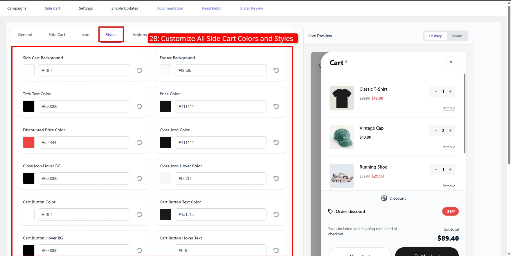
Scroll down for the Cart and Checkout button colors, then click Save Changes.
Addons tab
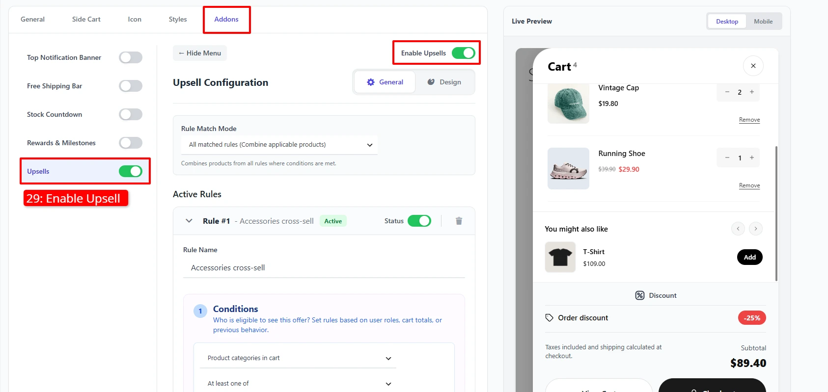
Bundles the drawer's conversion boosters. Each add‑on has its own on/off toggle:
| Add‑on | Availability | What it does |
|---|---|---|
| Upsells | Free | A rules‑based "You might also like" row inside the drawer — see the dedicated Side Cart Upsells guide |
| Top Notification Banner | Pro | A message bar at the top of the drawer |
| Free Shipping Bar | Pro | A progress bar toward a free‑shipping goal |
| Stock Countdown | Pro | An urgency timer that reserves the cart |
| Rewards & Milestones | Pro | Tiered rewards (e.g. discount coupons) unlocked as the cart total grows — see the Rewards & Milestones guide |
Example configuration
| Tab | Setting | Value |
|---|---|---|
| General | Display Side Cart | Enabled |
| General | Ajax Add To Cart | Enabled |
| General | Auto Open Side Cart | Enabled |
| General | Visibility | Entire Website |
| General | Exclude Pages | Cart, Checkout |
| General | Theme | Style 2 |
| Side Cart | Position | Right |
| Side Cart | Show Coupon Field / Order Discount | Enabled |
| Side Cart | Show Total in Checkout Button | Disabled |
| Side Cart | Heading Text | Cart |
| Icon | Enable Floating Cart Icon | Enabled (Bottom Right) |
| Icon | Navigation/Menu Cart Style | Elegant Pill |
| Icon | Display Cart Count Badge | Enabled |
| Addons | Upsells | Enabled (see Side Cart Upsells) |
What customers see
The Side Cart opens automatically whenever a product is added, showing live totals, an optional discount, upsell recommendations, and quick access to checkout — all without leaving the current page.
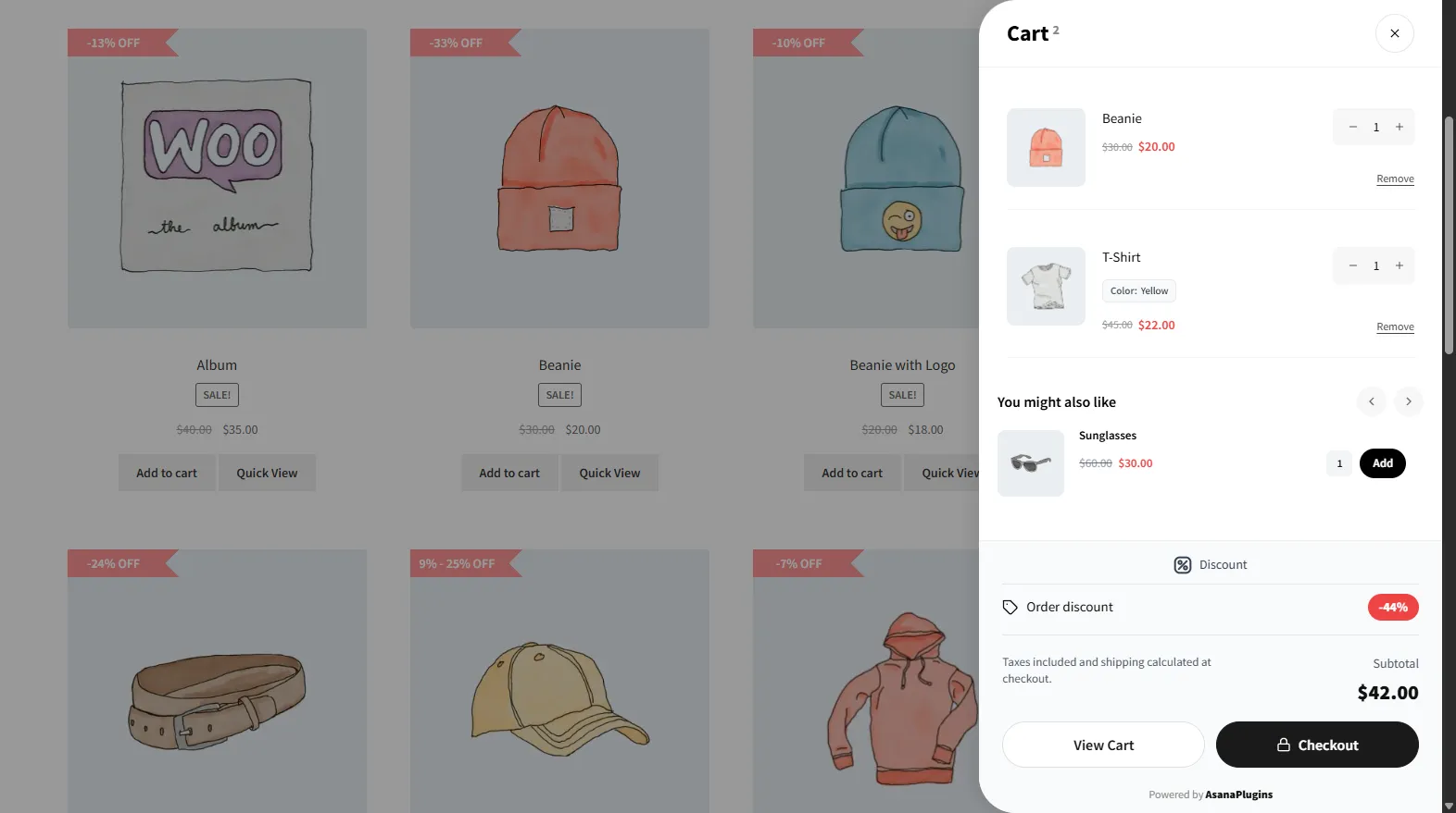
The upsell row also supports variable products, letting customers pick options before adding:
With Theme Style 2, the drawer takes on a rounded, soft‑grey card look:
- Keep Ajax Add To Cart and Auto Open on together — that's what makes the drawer feel instant.
- Always exclude the Cart and Checkout pages so the drawer never overlaps those flows.
- Enable Side Cart Upsells to turn the drawer into a revenue surface, not just a cart summary.
📚 Next Steps
Now that you've configured your side cart drawer, explore features to maximize its conversion potential:
- Side Cart Upsells — Display product upsell recommendations inside your side cart drawer.
- Rewards & Milestones — Add free shipping and discount progress bars to motivate higher order values.
- Product Upsell Campaigns — Add upsell blocks directly on single product pages.
- Cart Upsell Campaigns — Show upsell offers on the dedicated WooCommerce cart page.
- Product Upsell Popup — Trigger modal upsell popups when shoppers add items to cart.